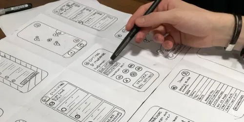
The sprint demo went well. Then someone opened the sign-up form on a phone, typed an email with a trailing space, and got a blank red box with no message. The team had tested the feature, not the screen.
This guide gives you the missing piece: a template, 38 worked examples and a checklist you can print.
UI test cases for a web app are written checks that confirm each screen looks and behaves correctly for a real user: forms validate input, navigation goes where it should, layouts hold at every screen size, controls work by keyboard, sessions start and end safely, and errors explain themselves. Each case has an ID, preconditions, steps, an expected result and a priority.
Key takeaways
- A good UI test case has one purpose, exact steps, a single observable expected result, and the test data it needs.
- Group cases by area (forms, navigation, layout, accessibility, auth, errors, security) so gaps are easy to spot.
- Mark priority honestly. Your P1 cases are your smoke suite and the first ones to automate.
- Write steps in plain language a new tester could follow. The same wording can become an automated test.
What is a UI test case?
A UI test case is a single, repeatable check of something a user sees or does on screen. It names the starting state, the actions to take and the result you expect, so two different testers get the same answer.
UI test cases sit inside the wider practice of UI testing, which also covers visual regression, cross-browser runs and tooling. This post stays narrow: what to write down.
New to writing test cases? Our guide on how to write test cases in manual testing covers the basics this post builds on.
What should a UI test case template include?
Seven fields cover almost every UI check, in a spreadsheet, a test management tool or a table like this.
| Field | What to write | Example |
|---|---|---|
| ID | Area prefix and number, never reused | FRM-03 |
| Title | What is checked, in under ten words | Email field rejects invalid format |
| Preconditions | State before step 1: page, user, data, browser | Logged out, on /signup, desktop Chrome |
| Steps | Numbered actions, one per line | 1. Type "anna@example" in Email. 2. Move focus to Password. |
| Expected result | One observable outcome | Inline message "Enter a valid email address" under Email; field has error styling |
| Priority | P1 (blocks release), P2 (fix before next release), P3 (cosmetic) | P1 |
| Test data | Exact values, or where to get them | anna@example, anna@example.com |
Copy-ready blank template
| ID | Title | Preconditions | Steps | Expected result | Priority | Test data |
|---|---|---|---|---|---|---|
| 1. 2. 3. |
Write one expected result per case, name exact data rather than "a valid email", and record browser and screen size in the preconditions, because UI bugs are often specific to both.
Example UI test cases for forms and validation
Forms are where most UI defects hide, because every field has a valid range, an invalid range and an edge. These eight cases cover a typical sign-up or checkout form.
| ID | Test case | Expected result | Priority |
|---|---|---|---|
| FRM-01 | Submit the form with every required field empty | Each required field shows its own error message; nothing is submitted | P1 |
| FRM-02 | Submit with all fields valid | Success state shown; data saved once; no duplicate on double-click | P1 |
| FRM-03 | Enter "anna@example" in Email | Inline format error appears when focus leaves the field | P1 |
| FRM-04 | Enter " anna@example.com " with spaces | Spaces are trimmed or a clear message explains the problem | P2 |
| FRM-05 | Type one character past the field's maximum length | Input stops at the limit or a message shows the limit | P2 |
| FRM-06 | Paste a 500-character string with emoji and accents into Name | Field accepts or rejects it cleanly; layout doesn't break | P2 |
| FRM-07 | Trigger an error, then correct the value | Error message and styling clear without a page reload | P2 |
| FRM-08 | Submit, then press the browser Back button | Form returns in a sensible state; no silent resubmission | P2 |
FRM-02 takes ten seconds and catches duplicate orders from impatient double-clicks.
Example UI test cases for navigation
Navigation cases confirm that every route a user can take goes somewhere real and comes back cleanly.
| ID | Test case | Expected result | Priority |
|---|---|---|---|
| NAV-01 | Click every item in the main menu | Each opens the correct page with the correct page title | P1 |
| NAV-02 | Open a deep link (e.g. /orders/123) while logged out | Redirect to login, then back to /orders/123 after sign-in | P1 |
| NAV-03 | Visit a URL that doesn't exist | A helpful 404 page with a route back to the app | P2 |
| NAV-04 | Use browser Back and Forward across three pages | Each step shows the right page and scroll position | P2 |
| NAV-05 | Refresh the page mid-way through a multi-step flow | User stays on the same step or gets a clear restart message | P2 |
Example UI test cases for layout and responsive design
Layout cases are the ones teams skip and users notice first. Run them at phone, tablet and desktop widths.
| ID | Test case | Expected result | Priority |
|---|---|---|---|
| LAY-01 | Load the main pages at phone width | No horizontal scrolling; nothing cut off | P1 |
| LAY-02 | Open the menu at phone width | Menu opens, closes, and every link can be tapped | P1 |
| LAY-03 | Zoom the browser to 200% | Text remains readable and controls stay usable | P2 |
| LAY-04 | Show the longest realistic value (long name, large number) in cards and tables | Text wraps or truncates with a tooltip; no overlap | P2 |
| LAY-05 | Load a page with empty data (new account) | A designed empty state, not a broken grid | P3 |
For LAY-01, WCAG 2.2's Reflow criterion (1.4.10) sets a useful benchmark: content should work without two-dimensional scrolling at a width equivalent to 320 CSS pixels. Our guide to browser testing covers which browsers to run these on.
Example UI test cases for accessibility basics
These six cases don't replace an accessibility audit, but they catch the failures that block real users. Each maps to a success criterion in WCAG 2.2, which the W3C published as a Recommendation on 12 December 2024.
| ID | Test case | Expected result | Priority |
|---|---|---|---|
| A11Y-01 | Complete the main flow using only the keyboard | Every action is possible without a mouse (WCAG 2.1.1) | P1 |
| A11Y-02 | Tab through the page | Focus indicator is always visible (WCAG 2.4.7) | P1 |
| A11Y-03 | Check every form field | Each has a visible label or instruction (WCAG 3.3.2) | P1 |
| A11Y-04 | Trigger a validation error | The field in error is identified and the error is described in text, not colour alone (WCAG 3.3.1) | P1 |
| A11Y-05 | Check body text contrast | At least 4.5:1 for normal text (WCAG 1.4.3) | P2 |
| A11Y-06 | Check icon buttons and images | Each has a text alternative (WCAG 1.1.1); tap targets are at least 24 by 24 CSS pixels (WCAG 2.5.8) | P2 |
Scanners help but don't finish the job. The open-source engine axe-core says it finds on average 57% of WCAG issues automatically, so keyboard and screen-reader checks still need a person. Our post on manual accessibility testing covers the rest.
Example UI test cases for login and sessions
Authentication screens combine UI behaviour with security rules, so test both. These cases follow guidance in the OWASP Authentication and Session Management cheat sheets.
| ID | Test case | Expected result | Priority |
|---|---|---|---|
| AUTH-01 | Log in with valid credentials | Lands on the dashboard with the right user name shown | P1 |
| AUTH-02 | Log in with a wrong password, then with an unknown email | Both show the same generic message (e.g. "Invalid user ID or password") | P1 |
| AUTH-03 | Paste a password from a password manager | Paste works in the username, password and MFA fields | P2 |
| AUTH-04 | Log out, then press Back | Protected page isn't shown; user is asked to log in again | P1 |
| AUTH-05 | Stay idle past the session timeout, then click | Session has ended; user is sent to login with a clear message | P2 |
| AUTH-06 | Fail login repeatedly | Throttling or lockout starts, with a message that doesn't reveal whether the account exists | P2 |
Example UI test cases for error states
Error states are part of the UI, and the ones users remember.
| ID | Test case | Expected result | Priority |
|---|---|---|---|
| ERR-01 | Disconnect the network, then submit a form | A clear "you're offline" or retry message; typed data is kept | P1 |
| ERR-02 | Force a server error (500) on a save action | Friendly message, no stack trace, no internal details | P1 |
| ERR-03 | Throttle the network to a slow connection and load a page | Loading indicators appear; no layout jumps when content arrives | P2 |
| ERR-04 | Upload a file of the wrong type and one over the size limit | Each is rejected with a message that says why | P2 |
Which security test cases belong in UI testing?
Some security checks are visible from the browser and fit in a UI suite as cheap tripwires. They don't replace scanning or penetration testing, which our guide to web application security testing covers.
| ID | Test case | Expected result | Priority |
|---|---|---|---|
| SEC-01 | Enter <script>alert(1)</script> in a text field, save, and view it | Shown as plain text; no script runs | P1 |
| SEC-02 | As a standard user, open an admin URL directly | Access denied page, not the admin screen | P1 |
| SEC-03 | Check the URL bar and page source after login and payment steps | No passwords, tokens or personal data in the URL | P1 |
| SEC-04 | Load the login page inside an iframe on another origin | The page refuses to render in the frame | P2 |
SEC-04 checks clickjacking protection. The OWASP Clickjacking Defense cheat sheet recommends sending Content-Security-Policy: frame-ancestors and X-Frame-Options headers, and notes that meta-tag versions of X-Frame-Options don't work.
Printable UI testing checklist
Use this before every release or paste it into your pull request template. Each line maps to cases above.
Forms
- Required fields show their own error when empty
- Valid submit saves once, even on double-click
- Format, length and whitespace edges are handled
- Errors clear when the value is corrected
Navigation
- Every menu link opens the right page and title
- Deep links survive login
- 404 page offers a way back
- Back, Forward and Refresh don't break flows
Layout
- No horizontal scroll at phone width
- 200% zoom keeps content usable
- Long values and empty states look designed
Accessibility
- Whole flow works by keyboard, with visible focus
- Every field has a label; errors are described in text
- Text contrast and tap target sizes checked
Login and session
- Generic login error for wrong password and unknown user
- Logout and timeout end the session; Back doesn't reveal data
- Paste works in login fields
Errors and security
- Offline, 500 and slow-network states handled
- Script input renders as text
- Direct URLs respect permissions
- No sensitive data in URLs; page can't be framed by other sites
How do you prioritise UI test cases?
Mark a case P1 if a failure stops a core task or puts data or security at risk, and run it on every build. P2 cases hurt trust or accessibility and run before each release. P3 is cosmetic. Your P1 cases are your smoke suite and the first ones to automate.
How do you turn UI test cases into automated tests?
Keep the wording you already have. A well-written manual case is already a script: a starting state, ordered actions and an expected result.
Robonito's AI Studio lets you describe a test in plain text, paste a URL or reference a Jira issue, and the agent works through the app step by step. Plain text to test case is on every plan, including Free. Here are four of the examples above, written the way you would describe them.
FRM-03, email format
- Go to the sign-up page.
- Type "anna@example" in the Email field.
- Click into the Password field.
- Check that the message "Enter a valid email address" appears under Email.
NAV-02, deep link after login
- While logged out, open /orders/123.
- Check that the login page appears.
- Log in as the test customer.
- Check that the order 123 page opens.
AUTH-04, logout and Back
- Log in as the test customer and open the account page.
- Click Log out.
- Press the browser Back button.
- Check that the account page is not shown and the login page is.
SEC-02, direct admin URL
- Log in as a standard user.
- Open the admin settings URL directly.
- Check that an access-denied message appears and no admin controls are visible.
Once a case runs, self-healing keeps steps working when labels, layouts or locators change, and logs each healed step for review. Each run keeps video, network traces and an AI root cause for failures.
Where Robonito fits, and where it doesn't
Robonito fits teams that already have test cases in documents or Jira and want them running without writing framework code. Web testing is on every plan, and you can build tests from plain text, by recording in the desktop app, or from reusable no-code steps. On Starter and above, suites run from Jenkins, GitHub Actions, GitLab CI or Azure DevOps.
It doesn't replace everything on this page. Accessibility still needs a person with a keyboard and a screen reader. The security cases are tripwires, not a penetration test, and Robonito isn't a security scanner. Deciding which cases matter is still your job.
See how it works on the web testing solution page, compare plans on pricing, or with your own P1 cases.
Frequently asked questions
What are test cases for UI?
UI test cases are written checks of what a user sees and does on screen: forms, navigation, layout, accessibility, login and error states. Each one has an ID, preconditions, steps, a single expected result, a priority and test data, so anyone can repeat it and get the same answer.
How many UI test cases does a web app need?
There's no fixed number. Start with one P1 case per core user task, then add cases for each form field's edges, each navigation route, each screen size you support and each error state. Count matters less than coverage: every high-risk journey should have at least one P1 case.
What should a UI testing checklist include?
At minimum: required-field and format validation, duplicate-submit protection, navigation and deep links, phone-width layout, keyboard access and visible focus, field labels, contrast, login errors, logout and timeout, offline and server-error states, and a few security tripwires such as script input and direct admin URLs.
What is the difference between a UI test case and a functional test case?
A functional test case checks that a feature produces the right result, often through any interface, including an API. A UI test case checks the result through the screen: what appears, where, how it responds to input and whether everyone can use it. Many cases are both.
Which security test cases can you run through the UI?
Ones a browser can observe: script input rendering as text, standard users blocked from admin URLs, generic login errors, sessions ending on logout and timeout, no sensitive data in URLs, and the page refusing to load in another site's iframe. Deeper checks need security scanners and penetration testing.
Turn your UI test cases into tests that run on every release. , or and automate your first five today.