The new checkout looked perfect on the designer's laptop, in Chrome's device toolbar set to an iPhone. On launch morning, support tickets came in from real iPhones: the "Pay now" button sat under Safari's bottom toolbar, and the card field disappeared behind the keyboard. Nobody had opened the page on an actual phone.
That gap, between "looks fine in emulation" and "works in a real mobile browser", is what mobile web application testing is for.
To test a mobile web application, check it at real phone viewports and on real browsers: Safari on an iPhone and Chrome on an Android phone, not only desktop emulation. Cover layout, touch, forms and keyboard, slow networks, offline and PWA behaviour, Core Web Vitals and accessibility, then automate the core journeys to run on every build.
Key takeaways
- Desktop emulation is a first check, not a sign-off. Chrome's own docs call device mode "a first-order approximation".
- iPhone browsers must use Apple's WebKit engine, apart from approved exceptions in the EU and Japan, so real Safari on iOS is the browser to test.
- The mobile-only bugs cluster around the viewport, the on-screen keyboard, touch targets and slow networks.
- Automate a small set of journeys across Chrome, Safari, a real iPhone and a real Android phone, and run them on every build.
What is mobile web application testing?
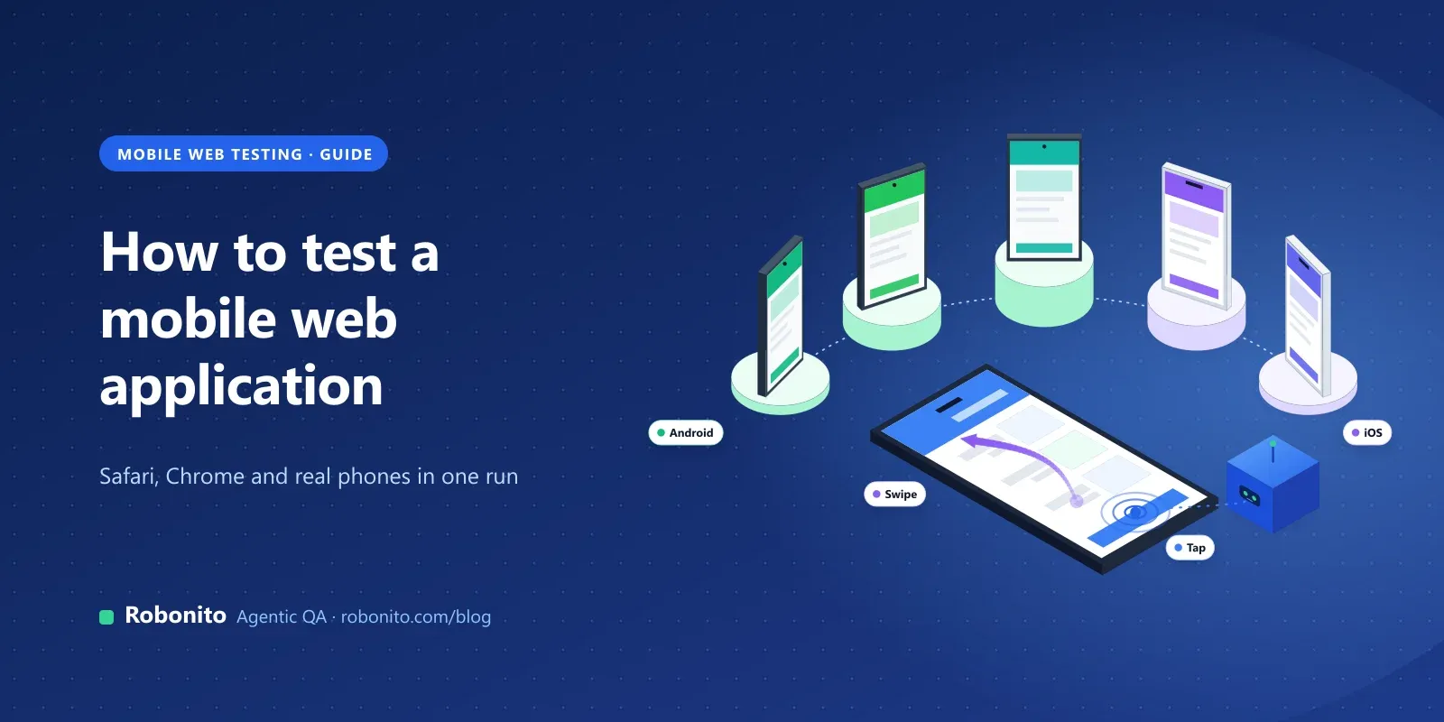
Mobile web application testing checks that a website or web app works, looks right and performs well in browsers on phones and tablets. That covers responsive sites, single-page apps and progressive web apps (PWAs) opened in Safari, Chrome, Samsung Internet or Firefox on a mobile device.
It is different from native app testing, where you install a build from the App Store or Google Play. For the full comparison, see web vs mobile application testing. This guide is the practical part: what to check, in what order, and on which browsers.
Why isn't Chrome's device toolbar enough?
Emulation changes the viewport size, user agent and touch events in a desktop browser. It doesn't run your page on a phone's hardware, operating system or browser build.
- Chrome's docs say so. Device mode is described as a first-order approximation, and the page adds that you "don't actually run your code on a mobile device". When in doubt, it recommends testing on a real device.
- Playwright's WebKit isn't Safari. Playwright's iPhone profiles emulate the device in its own WebKit build. Its browsers docs say that build is derived from the latest WebKit sources, often ahead of Safari, and that Playwright "doesn't work with the branded version of Safari".
- iOS browsers share one engine. Apple's App Review Guideline 2.5.6 requires apps that browse the web to use WebKit. Alternative engines are allowed only through entitlements for the EU and Japan. So Chrome on an iPhone usually behaves like Safari, not like Chrome on Android.
Emulation is still useful for checking breakpoints while you build. Treat it as step one, then finish on real browsers.
Which browsers and devices should you test a mobile web app on?
You can't test every phone. Use your own analytics to build tiers, and keep the per-build tier small.
| Tier | What's in it | When it runs |
|---|---|---|
| Per build | Safari on one recent iPhone, Chrome on one recent Android phone, plus desktop Chrome at a phone viewport | Every pull request or nightly |
| Pre-release | The browser and OS versions most of your mobile visitors use, a small phone, a large phone and a tablet, and your oldest supported iOS version | Before each release |
| Periodic | Samsung Internet, Firefox for Android, older Android versions, low-end hardware, landscape and split-screen | Weekly or monthly, and after major iOS or Android releases |
Always include real iOS Safari, because desktop browsers can't reproduce its toolbars, keyboard and engine version. And include a mid-range or older Android phone, because a fast laptop hides slow JavaScript.
How do you test a mobile web application, step by step?
Work through these in order:
- Layout and viewports: breakpoints, orientation, safe areas and zoom.
- Touch and the keyboard: tap targets, hover-only menus, input types and the on-screen keyboard.
- Forms and core journeys: sign-up, sign-in, search and checkout on a real phone.
- Slow networks: throttled connections, timeouts and offline.
- PWA behaviour: service worker, install, updates and push.
- Performance: Core Web Vitals on mobile hardware.
- Accessibility: screen readers, zoom, reflow and contrast.
- Cross-browser: the same journeys across Safari, Chrome and your other tiers.
- Automate and schedule: turn the core journeys into tests that run on every build.
How do you test responsive layouts and viewports?
Start with the layout, because a broken layout hides every other bug.
- Breakpoints. Check each breakpoint and the widths between them. Bugs often appear at in-between sizes, not at the exact breakpoint.
- Narrow widths. WCAG 2.2 Reflow (1.4.10) expects content to work at 320 CSS pixels wide without scrolling in two directions. Test there even if your analytics show wider phones.
- Orientation. Rotate the phone mid-journey. Check that forms keep their values and modals stay usable in landscape.
- Safe areas and notches. Fixed headers, footers and full-screen modals can collide with the notch, the home indicator or rounded corners.
- Browser toolbars. Mobile Safari and Chrome show and hide their address bars as you scroll, which changes the visible height. Elements sized to "full screen height" can end up partly hidden, as in the checkout story above.
- Pinch zoom. Make sure the page doesn't block zooming, and that zoomed content stays readable.
For visual regressions across sizes, add screenshot comparison. Our guide to visual testing covers how to keep it from becoming noisy.
How do you test touch, gestures and the on-screen keyboard?
A mouse is precise and can hover. A thumb can't. Many mobile web bugs come from designs that assume one.
- Tap targets. WCAG 2.2 Target Size (Minimum), 2.5.8, asks for targets of at least 24 by 24 CSS pixels, or enough spacing around smaller ones. Check close buttons, icon links and pagination.
- Hover-only menus. Menus and tooltips that open on hover need a tap equivalent. Check that a first tap doesn't trigger the link underneath.
- Gestures. Swipe carousels, pull-to-refresh and drag-to-reorder should work, and should have a button alternative.
- Input types. Email, phone, number and date fields should bring up the right keyboard. Check autofill and one-time-code fields on both iOS and Android.
- The keyboard covering fields. When the keyboard opens, the focused field and the submit button should stay visible. Test the last field on a long form, and test fixed footers while typing.
How do you test forms and core journeys on a real phone?
Run your most important journeys end to end on a real iPhone and a real Android phone: sign-up, sign-in, password reset, search, add to basket and checkout.
Watch for mobile-only problems: blocked sign-in pop-ups, payment pages that open in a new tab and don't return, cookie banners covering the button you need, and sessions that expire when the user switches apps.
Write each journey down as a short test case with an expected result, so it's easy to repeat and later automate. Our list of UI test cases for web apps is a good starting set.
How do you test a mobile web app on slow and unreliable networks?
Mobile users move between wifi, mobile data and no signal. Test the experience on all three.
- Throttling. Chrome DevTools offers presets such as mid-tier and low-end mobile, which combine slower network and CPU. Use them for first checks.
- Real networks. Run key journeys on a real phone on mobile data. Throttling profiles don't reproduce the jitter and drop-outs of a real connection.
- Timeouts and retries. Kill the connection mid-request. The page should show a clear message, keep the user's input and let them retry.
- Loading states. Every action that waits on the network should show that it's working, so users don't tap again.
- Large assets. Check image sizes and lazy loading; a hero image that's fine on office wifi can stall on a weak signal.
How do you test a PWA and offline behaviour?
If your web app has a service worker or a web app manifest, test it like an installed app.
- Install it from the browser to the home screen on iOS and Android, and check the icon, name and start screen.
- Go offline and reopen it. Cached pages should load, and uncached ones should show a helpful offline page.
- Queue actions offline if your app supports it, then reconnect and check they sync once, without duplicates.
- Ship an update and check that users get the new version, not a stale cache.
- Test push on iOS separately. The WebKit team's web push announcement says web apps can receive push from iOS and iPadOS 16.4, once added to the Home Screen and after a deliberate user tap to subscribe.
How do you check mobile performance and Core Web Vitals?
Google's Core Web Vitals set three targets, measured at the 75th percentile of page loads and split by mobile and desktop:
| Metric | What it measures | "Good" threshold |
|---|---|---|
| Largest Contentful Paint (LCP) | Loading | 2.5 seconds or less |
| Interaction to Next Paint (INP) | Responsiveness | 200 milliseconds or less |
| Cumulative Layout Shift (CLS) | Visual stability | 0.1 or less |
Mobile results are often worse than desktop ones, because phones tend to have slower CPUs and networks. Use Lighthouse with mobile settings for lab checks before release, and field data from real users to see what people actually get. For load and stress under traffic, see our guide to web app load testing.
How do you test mobile web accessibility?
Accessibility checks on mobile go beyond running an automated scanner on desktop.
- Screen readers. Navigate the core journey with VoiceOver on iPhone and TalkBack on Android. Every button and field should have a clear name, and focus should move in a sensible order.
- Text size and zoom. Increase text size in the phone's settings and zoom to 200%. Text shouldn't be cut off or overlap.
- Reflow. Check the 320 CSS pixel width from the layout step.
- Contrast. Check the contrast of text and controls, in dark mode too if your site supports it.
Automated checks catch missing labels and low contrast. Only a person with a screen reader finds a confusing journey.
How do you debug a mobile web app on a real iPhone and Android phone?
You don't have to guess what's happening on the phone. Both platforms let you attach desktop developer tools to a real device.
- iPhone with Safari. Turn on Web Inspector on the iPhone under Safari's Advanced settings, connect it to a Mac, and enable "Show features for web developers" in Safari on the Mac. The phone then appears in Safari's Develop menu, as the WebKit docs describe. iOS simulators appear there too.
- Android with Chrome. Enable developer options and USB debugging on the phone, connect it, and open
chrome://inspect/#devicesin desktop Chrome. Google's remote debugging guide covers the steps.
How do you automate mobile web tests across Chrome, Safari, iPhone and Android?
Manual checks find the first round of bugs. Automation makes sure they stay fixed.
- Pick five to ten journeys that would cost money or trust if they broke, such as sign-in, search, checkout and account changes.
- Write each one once, in terms of what the user does and sees, not pixel positions.
- Run it across your per-build tier: desktop Chrome at a phone viewport, Safari on a real iPhone and Chrome on a real Android phone.
- Trigger it from CI on every merge, and run the pre-release tier before each release.
- Keep evidence. Video, screenshots and network logs for every failure, so nobody has to reproduce it by hand.
- Review failures before rerunning. A rerun that passes hides the cause.
Tests that find elements by meaning, such as a button's visible label, survive responsive changes better than tests tied to positions. Our guides to browser testing and automated regression testing cover the wider setup.
Which mobile web bugs should you look for first?
These are common patterns, not a ranking.
| Bug | Where it usually shows up | How to catch it |
|---|---|---|
| Button hidden under the browser toolbar or home indicator | iOS Safari, full-height layouts | Real iPhone, scroll and check fixed elements |
| Field hidden behind the keyboard | Long forms, fixed footers | Real phone, fill the last field |
| Menu needs hover | Desktop-first navigation | Tap-only walk-through |
| Wrong keyboard type | Email, phone, card and code fields | Real iOS and Android phones |
| Duplicate order or form submission | Slow networks, fast taps | Throttling plus double tap |
| Stale version after release | PWAs with a service worker | Update test on an installed app |
| Layout shift as ads or images load | Content pages, product pages | CLS in Lighthouse and field data |
Mobile web application testing with Robonito
Robonito is an agentic QA platform: AI agents create, run and maintain end-to-end tests. For mobile web applications, that means you describe a journey once and run it as a repeatable test.
- Plain-language tests. In AI Studio, describe what to test ("sign in, add the first product to the basket, check out with the test card"), paste a URL or reference a Jira issue, and the agent works through the app step by step. Plain text to test case is on every plan, including Free.
- One journey, many runs. Web testing is on every plan, and cloud runs execute in parallel in isolated workers. Write the journey once and reuse it; the cross-browser testing page explains how browser coverage works.
- Self-healing. When labels, layouts or locators change, for example after a responsive redesign, steps adapt instead of failing, and healed steps are logged for review.
- Evidence. Every run keeps video, network traces and an AI root cause for failures, plus pass rates and trends across runs.
- Real devices for your native app. If you also ship a native app, mobile app testing for Android and iOS is on Pro and Enterprise, with runs on Robonito's real device farm. Web and mobile tests are then managed in one platform.
- CI and tracking. Jenkins, GitHub Actions, GitLab CI, Azure DevOps and CircleCI, plus Jira and Slack, on Starter and above.
Pricing. Free covers web testing with 100 test cases, 1 parallel run and unlimited local runs. Starter is $20 a month and adds CI/CD, Jira and Slack. Pro is $199 a month and adds mobile, desktop and API testing, with 10 parallel runs. Enterprise is custom; see pricing.
Where it doesn't fit. If your developers want browser tests in the repository, written in TypeScript and run on every local change, a code framework such as Playwright may suit that layer better. Automated runs don't replace a person trying the journey with VoiceOver or on a weak signal. And if you need specific phone models or browser versions, bring your list to a demo and check it against what Robonito covers before you commit.
with your top mobile journey, or on your web app.
Frequently asked questions
How do you test a mobile web application?
Check layouts at real phone widths, then test touch, forms and the on-screen keyboard on a real iPhone with Safari and a real Android phone with Chrome. Add slow-network, offline and PWA checks, measure Core Web Vitals on mobile, and test with VoiceOver and TalkBack. Finally, automate the core journeys and run them on every build.
Can I test a mobile website without a real phone?
You can start without one. Chrome's device mode and Playwright's device profiles are good for checking breakpoints and touch events early. But they run on your desktop, not on mobile hardware or the real mobile browser, so keyboard, toolbar, performance and Safari-specific bugs can slip through. Finish every release on at least one real iPhone and one real Android phone.
Is Chrome on iPhone the same as Safari?
Mostly, from a testing point of view. Apple's App Review Guidelines require iOS browsers to use WebKit, Safari's engine, with alternative engines allowed only through entitlements in the EU and Japan. So Chrome on an iPhone usually renders like Safari, not like Chrome on Android. Test Safari on iOS first, then spot-check Chrome on iOS.
What is the difference between mobile web testing and mobile app testing?
Mobile web testing checks a website or web app running in a phone's browser. Mobile app testing checks a native app installed from an app store, including installs, updates, permissions and push notifications. Many teams need both, because customers use the website and the app. Our comparison of web vs mobile application testing covers the differences in detail.
Which Core Web Vitals should a mobile web app meet?
Google's "good" thresholds are an LCP of 2.5 seconds or less, an INP of 200 milliseconds or less and a CLS of 0.1 or less. They're measured at the 75th percentile of page loads, separately for mobile and desktop. Mobile usually scores worse, so check mobile results on their own rather than relying on a desktop score.
How many devices do I need to test a mobile web app?
Fewer than you'd think. On every build, run your core journeys on Safari on one recent iPhone and Chrome on one recent Android phone. Before each release, add the browser and OS versions most of your visitors use, a small and a large screen, and your oldest supported iOS version. Base the list on your own analytics.
Stop finding mobile bugs in support tickets. to see your top mobile journey run as a plain-language test, or .